HBO Max
Adding a new feature called "My Curator" for Smart TV interfaces that recommends movies & series based on their current preferences for that viewing.
(This is a personal project)
Project Timeline: Sept 2022 (2 weeks)
My Role: End-to-End UX/UI Designer
My Tools: Figma, Otter.Ai, Optimal Workshop, Miro Whimsical, Marvel, Notability, Zoom, Google Suite

01.
OVERVIEW
Project Background
How do we handle "Choice Paralysis" within streaming platforms?
Streaming platforms offer an abundance of choice when it comes to what to watch. There is a lot of competition for our attention and users have the freedom to leave one streamer to browse another within seconds if they’re not enthusiastic about the film selection. With such large libraries of content, sometimes it’s difficult for users to decide - this is called “choice overload”. It’s a cognitive impairment in which people have a difficult time making a decision when faced with many options.
Many users have simply relied upon word-of-mouth suggestions to help them decide. Streaming platforms have tried to assist users through providing static alt-genre lists, using algorithms to predict our preferences, and spotlighting movies they want us to watch. But still, it appears a problem persists.
The Problem
Users struggle to quickly find movies they are excited to watch on HBO Max that match their current preferences for that particular viewing. Despite so many options, nothing generates excitement and they leave the platform for another to find something they want to watch.
The Challenge
How might we help users narrow the scope of quality titles for them to decide & watch in a fun and engaging way?
The Solution
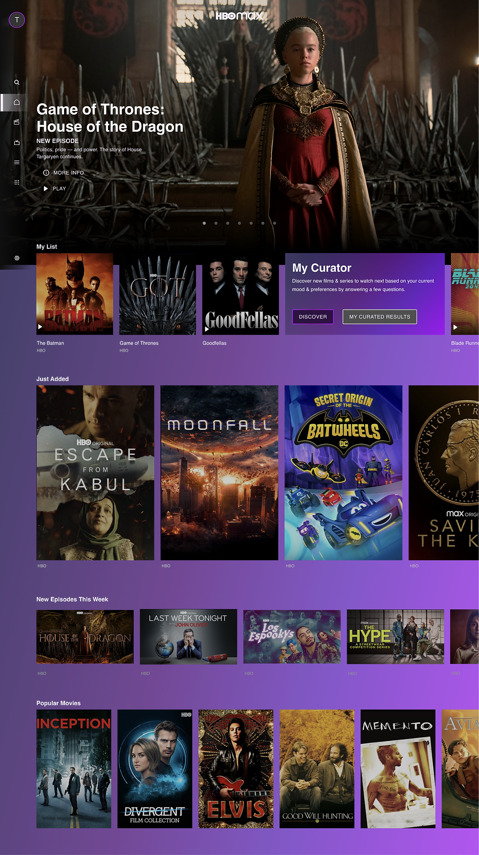
A new feature called "My Curator", which allows users to answer a short set of randomized questions to gauge their current mood and preferences, to ultimately generate a small list of personalized titles for them to decide upon to watch for that viewing.
.png)
02.
RESEARCH
Research Plan
My main research goal was to learn about users' experiences and thoughts on decision-making within streaming platforms, so that we can better enhance their delight in the process. I wanted to work through what factors influence their decisions, either toward watching a new movie or away from the platform, leaving it altogether.
Objectives
-
Understand users’ decision-making process for choosing a title to watch
-
Understand the users’ journey in this process.
-
Determine what factors help users decide on a title to watch
-
Learn why users may leave streaming platforms
User Observation
I was able to sit down with a 39 year old, male participant to observe their behavior, tactics, and comments when deciding on a movie to watch on HBO Max. I compiled this data into a User Journey, noting their highs and lows throughout their process (see below).
It took the user a total of 12 minutes and 40 seconds to choose a movie they wanted to watch.

Surveys
I distributed surveys online to acquire quantitative data on users who subscribed to streaming platforms to learn what things matter to them when discovering what to watch.

Insights
Insight #1 - Curation > Overchoice
Users want options, but they don’t want everything.
Unlike what Netflix offers (algorithmic suggestions strictly within their long-term preferences), users like to & want to explore new movies on their own, in smaller batches based on their current mood.
Once users know what genre of movie they prefer in that sitting, then they look to if it’s award-winning, quality, and popular (in the zeitgeist).
"Wow, there are some good movies on here... I didn’t know!"
Insight #2 - Guiding Reviews (& Recommendations) to Save Time
Users trust rating systems from Rotten Tomatoes or IMDb to help guide their viewing choices.
Users are looking for quality filmmaking to make sure their 2 hour viewing commitment is rewarded with a positive experience. That experience starts with the decision-making process, asking themselves the question of “what movie should I watch tonight?”.
With this feature, I'm hoping to quickly usher users to a few quality choices, so they won't feel inclined to look to 3rd party review websites, but that they'll inherently trust HBO Max’s recommendations.
“I want less content, but more accuracy with the content."
If you'd like a closer look at my research presentation, click on the button below.
Competitive Analysis
Here's how the top competitors of HBO Max stack up based on their use of algorithms, along with their key strengths and shortcomings! This secondary information was gathered through a variety of articles, including important reading from AMT Labs titled, "How Streaming Services Use Algorithms".

03.
IDEATE
Sitemap
I laid out the existing structure of HBO Max's navigation for a Smart TV's interface, building out the top level navigation items, as well as secondary items (usually in a list of options). I determined the feature's location with the goal of helping users quickly identify a movie or series they want to watch, the logical step is a high visibility spot - the home landing page.
"My Curated Results" made sense to belong near their existing "My List", a feature to save titles for later viewing. The principle is the same, so that feature would be tucked under Profile.

User Flows
I detailed the overall user flow when a user goes to HBO Max. How would they find a movie, what choices do they make when selecting a title to watch? I wanted to explore the primary routes the user had access to within HBO Max, while adding another path for users to choose.

Task Flows
Looking more closely at the feature's flow, it was important to swiftly launch users into answering a series of unique, fun questions to ascertain their mood and preferences in a format that felt familiar. There is an Intro Page, a Series of 5 Questions, followed by a Results Page that displays the curator's recommendations - which then allows users to click on a movie or series and complete the objective.

UX Writing:
Chapter 1
For this feature, I need the curation questions to be imaginative, while being clear & concise.
My goal was to help users visualize and express themselves through their answers. I wanted the process of answering questions to be exciting... not only about the possibilities of what it might generate, but that THE PROCESS would be delightful too -- like they're exploring a film archive in the depths of a Hollywood studio, with a guide who knows and speaks the language of cinema.
-
What do you feel like doing right now?
-
What award category interests you the most now?
-
What setting or environment appeals to you at the moment?
-
How important is a star-studded cast?
-
How much time do you have to watch something?
I wanted to make sure the wording was tested. How did users respond to these questions? More on this later.
04.
DESIGN
Wireframe Sketches
I needed to sketch out and get familiar with the existing grid/block system of HBO Max. I wanted to have the new curator feature to feel native & consistent with the platform, but also distinct enough to form its own landmark within the information architecture.
Then it was visually mapping out what the feature would procedurally look like in its flow.

Lo-Fi Testing
I wanted to get some quick A/B feedback on deciding between Home Page locations, as well as the Questions format. I quickly ported my sketches into Marvel to get first impressions about the task flow from a couple of participants for some Lo-Fi Usability Testing.
It was helpful for me to understand users’ mental models of where they would expect to find things with this low-fidelity prototype, matters of graphic or visual design did not come into play. I didn't want them influenced by the already existing visual design, instead I wanted their focus on the interactions of the new feature.
Mid-Fi Wireframes
Now that I had some direction on which screens users preferred, I went forward with Mid-Fi wireframes, eventually evolving to Hi-Fi wireframes (with brand colors, images, iconography)

Style Tile
I followed the already established main brand colors, while supplementing their private use typeface with a more accessible Helvetica.
For the questions, I reinforced the possible word selections with evocative lineal icons to help with comprehension, as well as to inspire users to visualize the movie they want to watch.

06.
TEST & ITERATE
Hi-Fi Testing
With already one Lo-Fi Usability Testing complete, I conducted a second round of usability testing with my Hi-Fi Prototype to ask participants about the usability, visual design, UX writing, and overall opinion about that feature, as well as what else they would want to see.
Task Flows to Complete:
-
Locate "My Curator" & Complete the Question Format
-
Locate "My Curated Results"
Number of Participants: 3 males & 1 female
Ages: 21-34 years old
Analysis & Prioritization
I take active notes while conducting usability testing which prove to be vital when taking stock of everything I've observed. I have back-ups of Zoom Recordings and Otter.ai Transcriptions, but the thing I refer to the most are the raw scribbles that I took during the tests.
I compiled the key observations from each participant, and then sorted them into categories. From there I could identify the areas participants had the most to say about.


For the Prioritization Matrix, I flagged the tasks (in red) that were most feasible for this round of iteration, addressing the most frequent issues (determined by how many participants voiced this problem) and the most severe issues (determined by the usability impact that improvement would make).
I would address the others (in purple) ideally in another round of iteration and testing. Some were suggestions that would need further exploration.
Improvements
Here are the top 3 major improvements to the user interface following the usability testing.
1. Locating their Curated Results Later


Problem
Many users struggled with finding their curated results under "My Profile". Although it aligns with the existing structure of where users find saved for later titles in "My List", it was near impossible for newer users to locate.
Solution
I created a shortcut button next to the "Discover" button to help guide users jump right to their last results.
2. Adding a Retake Button


Problem
Upon finishing "My Curator", users were curious about retaking the assessment (whether they wanted to enjoy the process again or were unhappy with the results). There was currently no way of quickly doing so.
Solution
I added a button on the Results Page, allowing users to easily retake the assessment, which would bring them back to a brand new, randomized Question #1.
3. Adding an Alternative Option to Questions
Problem
Users suggested people may not be inclined toward any of the available answers and instead want to pursue another "Other" option. They didn't want to feel pigeon-holed in their answers if that wasn't a true reflection of their mood.

Solution
I considered adding an "Other" or "None" option on each question, but most questions in this short assessment need some direction to form meaningful connections with its content library. I chose a few selected questions and added this alternative option.
UX Writing: Chapter 2
I was glad to hear that the participants all voiced that the questions were interesting, unexpected (in a good way), and thoughtful. Participants were divided about the importance of some question - cinephile users caring more about awards, while others casual users caring more about the time and MPA rating.
One thing that was agreed upon was that language of "Quiz", which was used in the earlier history of the feature. Some related it either to serious test-taking at school or the opposite feel of mindless BuzzFeed Internet quizzes.
I needed the feature's name to reflect the sophisticated nature of classic cinema and the HBO brand, while also enticing old & young users alike to learn more about it.
That's when I decided on "My Curator" - a guide you've been looking for to help you make decisions by narrowing the scope to a small spread of perfect options for you to choose.
07.
SHOWCASE


Click to expand image
08.
REFLECT
Improvements
A number of participants mentioned having a percentage match system on the Results Page that would inform users how closely the movies or series match their answers. This makes sense given Insight #2 of users having comfort with 3rd party review & scoring systems. Due to the turnaround on this project, I wasn't able to implement that update, but it would have been interesting to explore - there are pros & cons to that system, either caring TOO much about a percentage that users ignore good titles, or ever having sufficient data points to produce a meaningful spread.
Regardless! I observed points of feedback that would impact other areas on the interface or information architecture. For instance, my users struggled to find "My List" on the existing interface - with others pointing to other platforms as good examples or as cautionary tales. Brand speaks to the experience, and HBO Max had a different and unique approach when considering this new feature.
Takeaways
There was great conversation and feedback with research participants, as well as separately with friends and family about recommendations provided by streaming platform algorithms and what is considered a "successful" experience, along with how different platforms navigate that concept. With a combination of my prior career background and my interest in how people discover new content, this was a fun project to invest time & effort in.
There is a lot to explore in this sector with UX Design and I'm excited to learn more about it.
This project is a personal exploration of HBO Max features. I am not associated with nor have I been compensated by WarnerMedia to create this project.